Go High Level – 2024
Designing an internal lead management feature to reduce human errors
The Challenge
I identified the need for a simpler way to update contact records within GoHighLevel (SaaS), aiming to create a solution that allowed users to update records without leaving the app and with minimal opportunity for staff errors.
Every mishandled lead in a CRM system costs a business time and potential revenue. At GoHighLevel, users were building elaborate workarounds – like creating external web pages just to host simple forms – all to avoid errors when updating specific contact records.
For less tech-savvy team members, these complex processes created anxiety and resistance to using the system. Even advanced users struggled to create foolproof workflows for their teams.
As a user of the SaaS myself I had first hand experience of seeing how challenging it can be for those less technically confident.
I decided to create a solution that makes it easy for both business owners and their staff to process leads without errors, safeguarding client relationships and sales opportunities.
Key Results
- A new feature called Internal Forms
- Positive feedback for feature on usability tests
- Streamlined user flow
Methods
- Research
- Information architecture
- Wireframing
- UI prototyping
- Usability testing
Role
Sole UX/UI Designer
Timeline
What makes GoHighLevel unique?
Designed to be an all-in-one software for agencies to resell to their own niche of clients, the SaaS platform aims to provide every tool and feature that a business could ever need to “elevate their marketing and sales”.
Learn more about GoHighLevel
Founded in 2018 it has very quickly disrupted the SaaS industry, knocking its competitors (such as Clickfunnels, ActiveCampaign, Kajabi and many more) out of the park with their ability to shape their new and existing features based on community feedback. GoHighLevel’s business model and speed of launching new features is unparalleled in comparison.
Their primary target user is agencies, and ultimately the end user of the software are the small/medium businesses who work with the agencies that resell the SaaS. In January 2024 GoHighLevel reported they had almost 60,000 agency customers, spanning across 140 countries.
However, when you have an overwhelming range of features and functionalities available to you as a user, it’s easy to become overwhelmed and stuck.
The Solution
Based on extensive user research and testing, I designed Internal Forms – a feature that streamlines lead management processes directly within GoHighLevel. This solution eliminates the need for external workarounds while making the platform more intuitive for teams of all technical abilities.
The design prioritizes accessibility for users of all technical backgrounds while accommodating diverse business workflows.
Metrics I would love to measure:
- Adoption rates/user engagement with the internal forms
- Error rates
- Conversion rates, to see a percentage of users who successfully complete a form after viewing it
All of the above are indicators of improved lead management efficiency.
Discovery
Defining the big problem
The community of users had spoken…
A user had submitted a feedback request on the platform’s Ideas board (see below) and there were several comments supporting this idea.
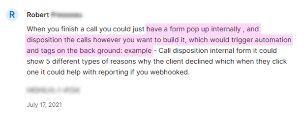
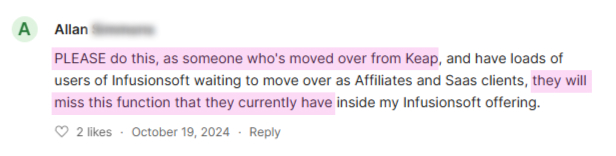
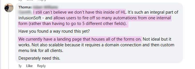
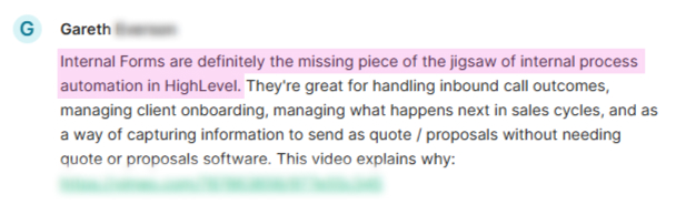
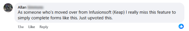

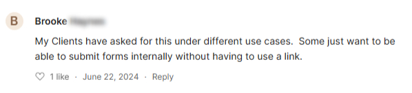

There was clearly an opportunity for something to be improved.
Understanding how businesses were currently creating “work-around” solutions
Due to my familiarity with the software I had assumptions about how users were creating their own unique way of handling their leads and contacts entirely. However, after speaking to several users and doing a deeper dive into the Ideas board and the active online community group, it highlighted to me a few other methods users were using.
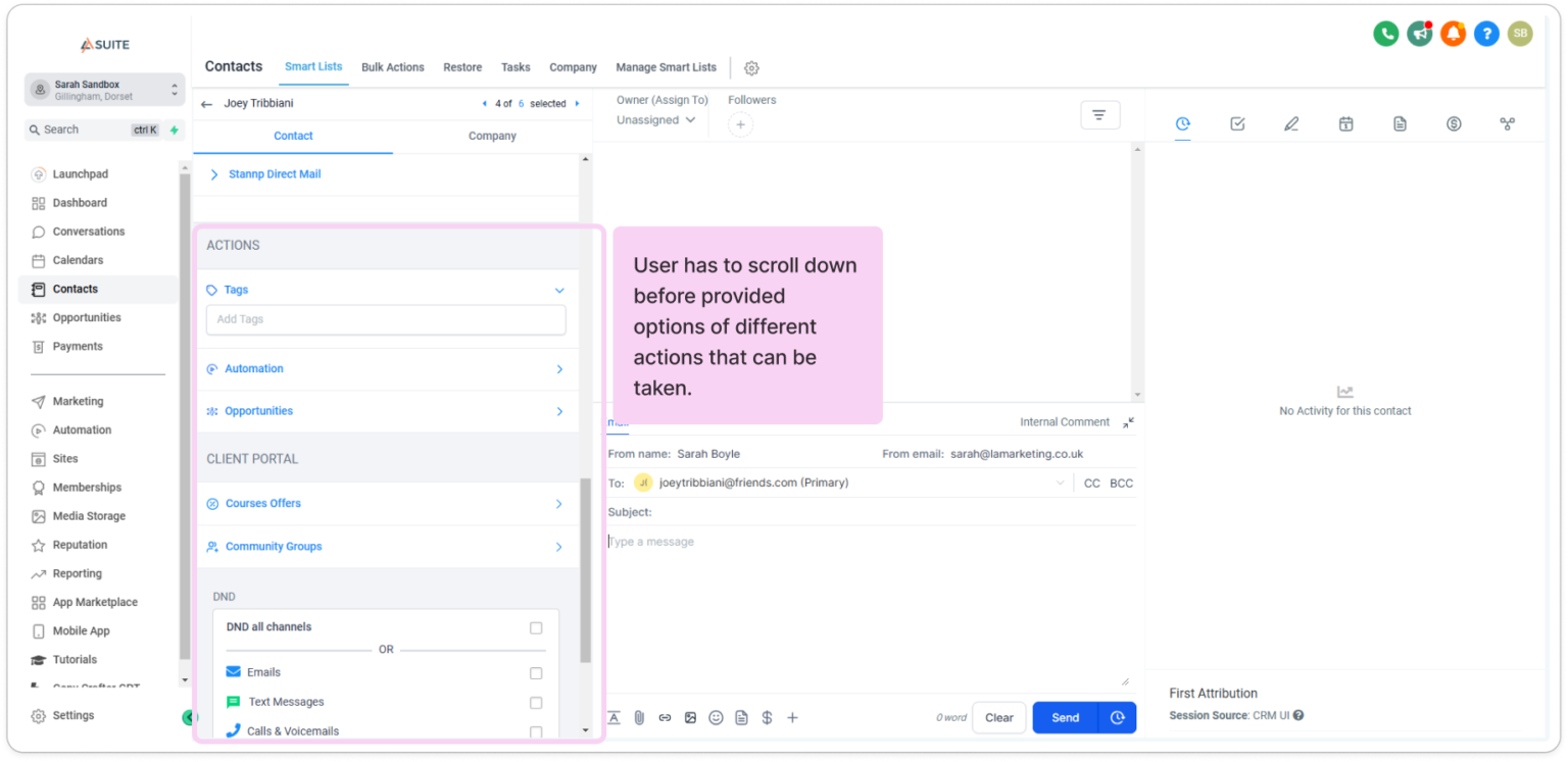
To better understand what this process looked like for those users, I mapped out the user flows of each of their processes mentioned and created several user flows to better understand the number of steps taken and the possible friction points.
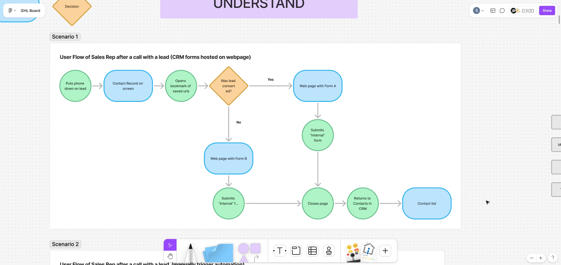
The problem with this is the user is leaving the platform to process leads, potentially leading to distraction of workflow.
Tasks involving more than 5 steps had a 40% higher error rate
Time-sensitive tasks after calls often lead to skipped or rushed entries
Suggestion prompts within CRMs are found to increase task completion rates by 22%
For technically advanced users, this isn’t even a problem
Many advanced users who knew the software inside out were very comfortable with how they trigger certain processes. However, being mindful that GoHighLevel’s target audience is agencies who resell the SaaS to business owners whose technical confidence will vary greatly, I believe that the majority of end users for the platform could benefit from a more streamlined, user friendly way of processing leads.
Based on my research, there was a need for the functionality of creating and submitting forms that were hosted internally within the platform, enabling users to update specified fields a business needed based on their own unique situations.
How will this new feature will contribute to business goals?
To cite GoHighLevel’s website: “…our goal has always been to create a sustainable, powerful, “all things marketing” operating system that creates limitless opportunities for our customers.”
Users benefit from a more efficient workflow, with automation triggers and custom record-keeping reducing repetitive tasks and enhancing overall satisfaction with the platform.
This feature sets GoHighLevel apart from competitors by providing a solution for streamlined internal operations, catering to businesses needing efficient internal workflows.
Incorporating this feature allows the SaaS to scale with customers’ evolving needs, supporting the growth of their users needs.
The research above led me to identify 3 pain points from the existing SaaS platform
If standard forms (in their current format) are used then they have to be embedded on a separate page – which requires a domain connection.
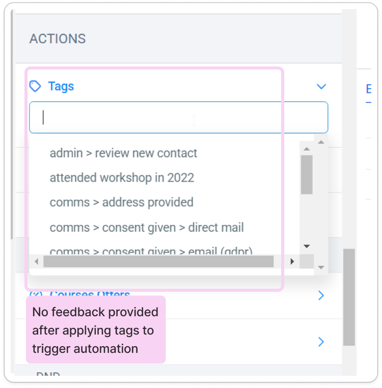
Several users are utilising custom field updates as the trigger, however this often leads to lack of clarity if their saved changes have triggered the required automation.
Third-party plugin software had been developed to provide the desired functionality (at a cost) of having an easily accessible form for users to submit within the contact record area.
Additionally, I had to work with some constraints…
Users needed to intuitively know where to go to create, edit and use the internal forms.
I was working on this as a team of 1 which meant time and resources were limited.
The SaaS is already bursting at the seams with features. Adding another to the list could lead to overwhelm and confusion.
The Goal
With all this in mind, I had a goal and 4 objectives…
Design a new feature which provides a centralised, discoverable user-friendly process to better help businesses and their staff internally manage their leads, to increase staff productivity and minimise risk of human error.
The result is the SaaS providing a more robust and reliable experience, which will further lead to a more positive experience and association for the business with the GoHighLevel platform.
How I'm going to get there
- Evaluate the IA
- Develop a prototype
- User test
- Revise & finalise
Information Architecture
Where is this feature needed?
In a software that is jam-packed full of features, it was important that this new feature is easily discoverable when required. Based on my research, there were two “locations” a user would want to apply/update custom information to a contact record:
- From the contact record
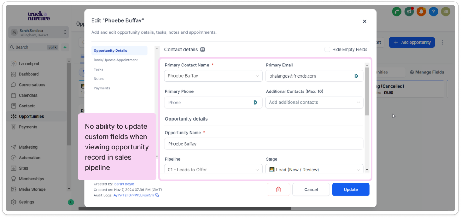
- From the opportunity within the sales pipeline
With that in mind, I brainstormed ideas on how to best integrate this feature within those screens.
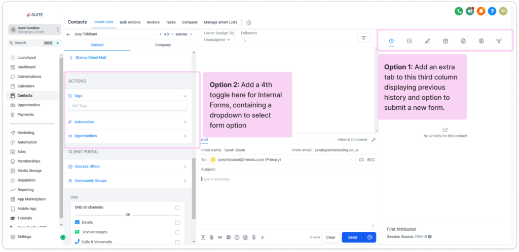
For the contact record page:
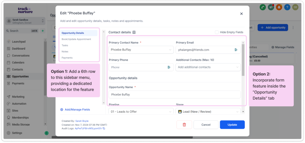
For the sales pipeline opportunity page:
Web Form VS Internal Form
GoHighLevel already has a web form functionality, however submission of these forms are typically for collecting information from outside sources (for example a new lead).
Web forms come with limitations though; they must be embedded on a web page and are not accessible to submit within the software.
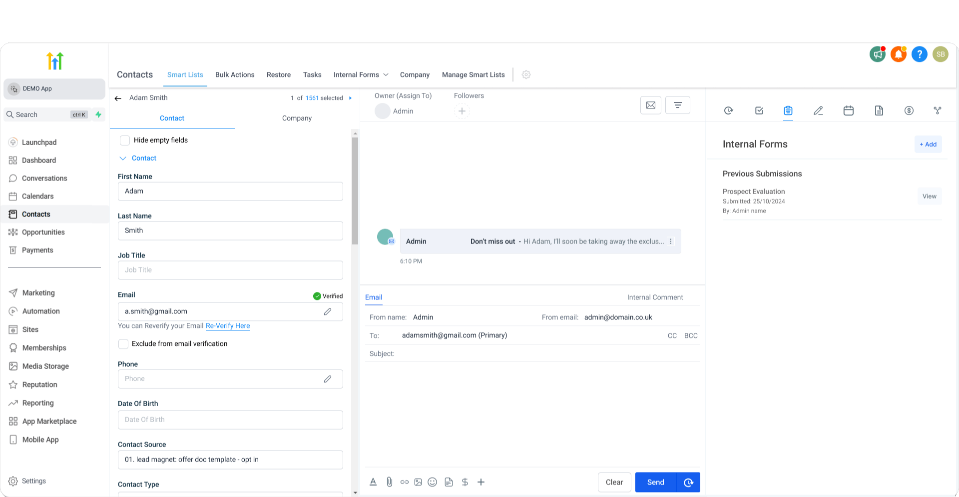
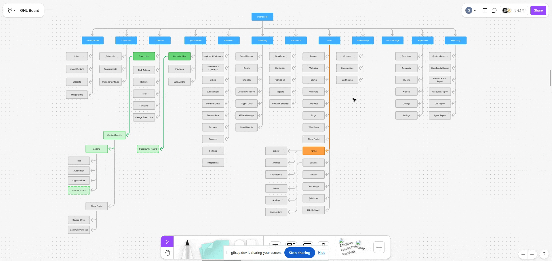
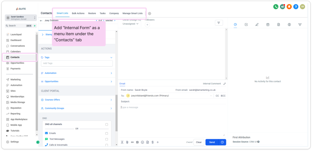
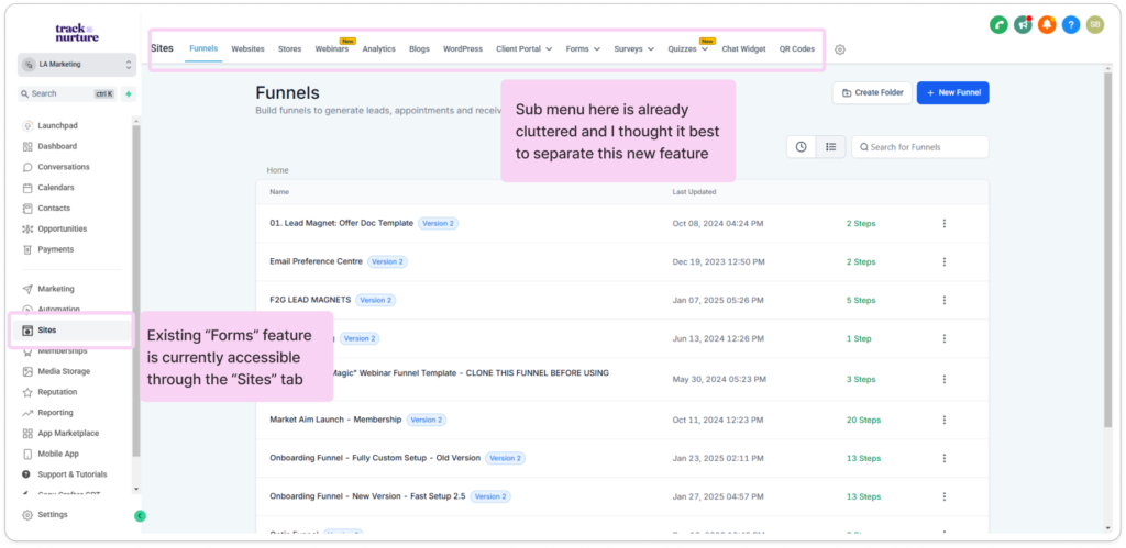
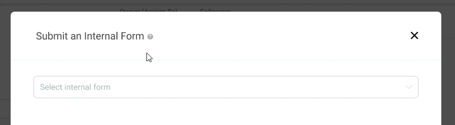
To ensure the new Internal Form feature was discoverable for users to create and edit the forms I decided that it made sense to add to the feature to the sub menu under the Contacts tab:
The existing “Forms” feature is housed under the “Sites” tab, and initially I considered housing this new feature here too, however the menu is already busy and I wanted to differentiate to the user the difference in purpose that the new Internal Forms feature served.
Functional specs
Setting design integration criteria
After clarifying the information architecture, my next focus was on creating the flows of the design, which are essential to the feature’s functionality. Understanding potential flaws in this step would help me determine the screens, elements, and components needed in the next stages of the design.
Need to be able to access feature from multiple locations
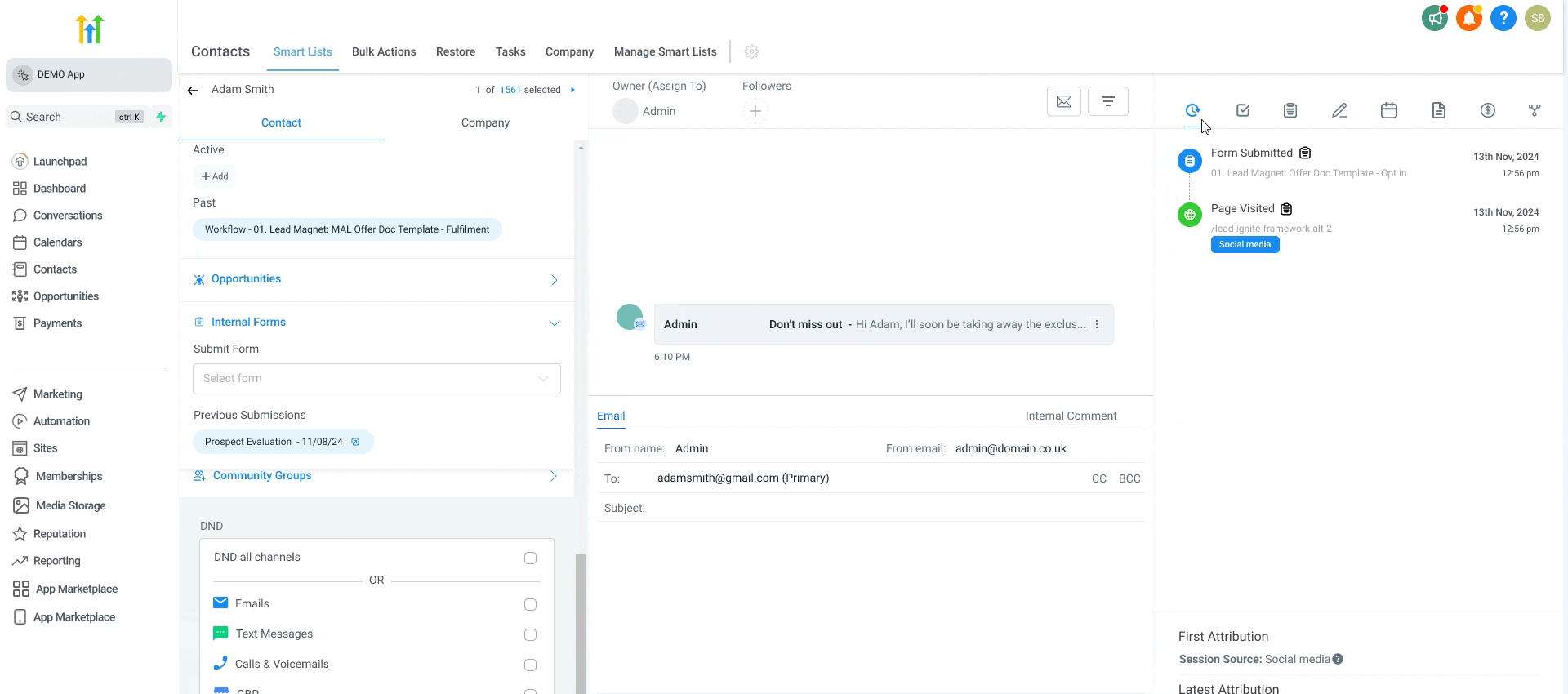
Must be able to view previous form submissions
Need a set location to create/ customise these internal forms
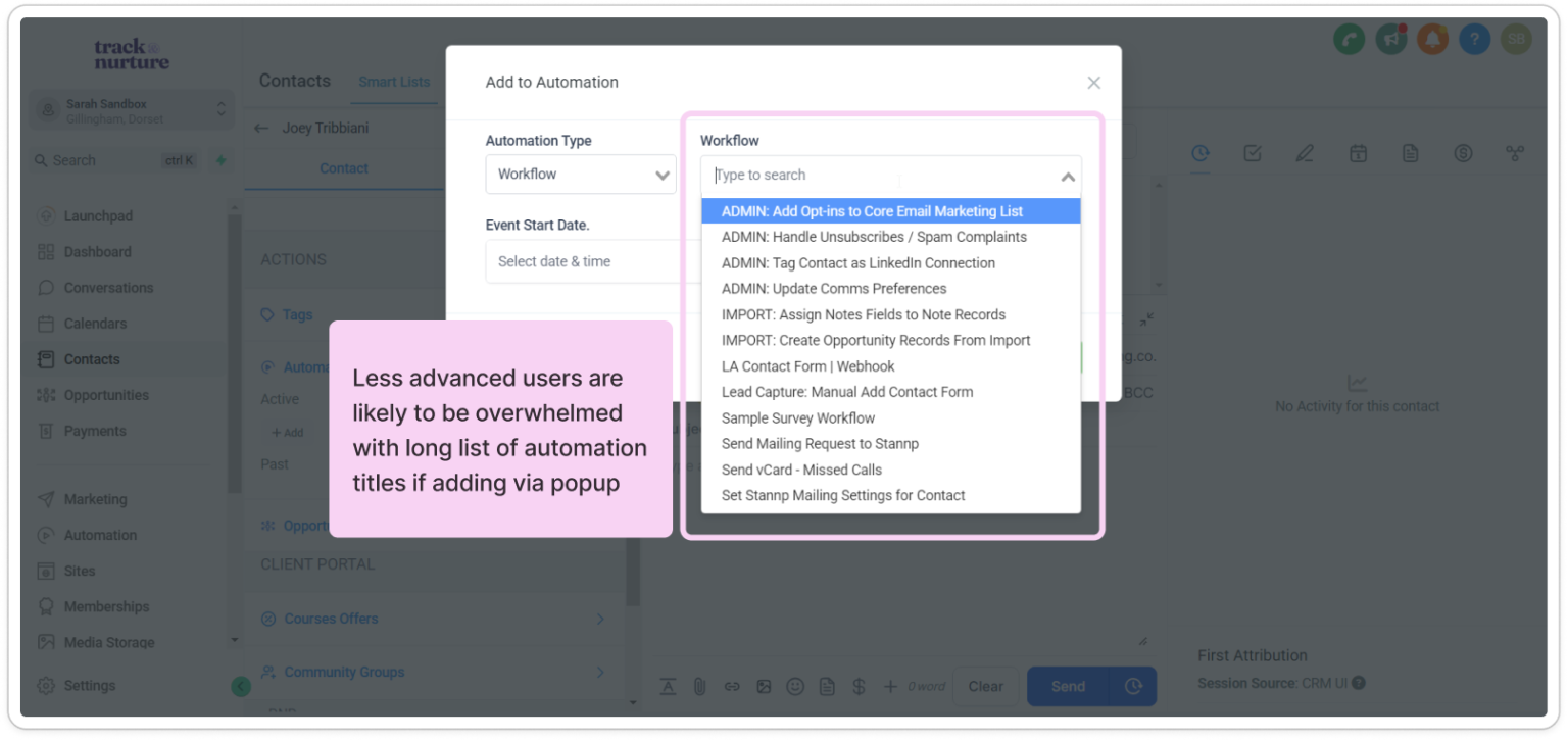
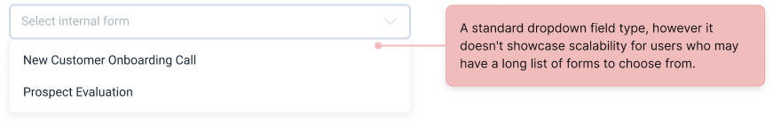
I also explored multiple designs for the dropdown form selection, considering what it would look in an edge case scenario if a user has over 20 internal forms.
Below is my exploration process of considerations I made to make it as easy as possible for the user to find the specific form they’re looking for.
My first draft of the dropdown field was very standard in terms of layout. Although the majority of users would (I assume) not need more than 10 forms, this UI didn’t take into consideration what a long list of dropdowns would look like.
State: dropdown expanded
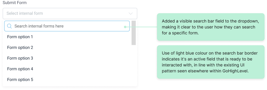
In my second draft I introduced the scroll bar and explored what search functionality could look like. However it’s not obvious that user can search using the top field, nor is it easy for the user to scroll to a specific form if they already know its name.
State: dropdown expanded
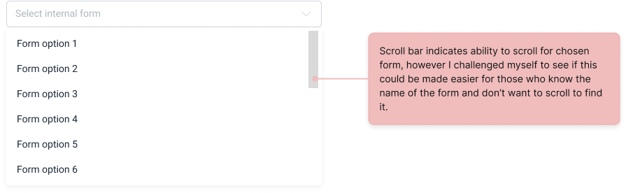
State: search result
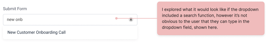
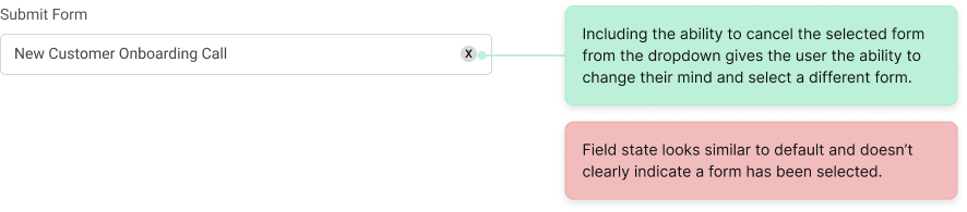
State: selected
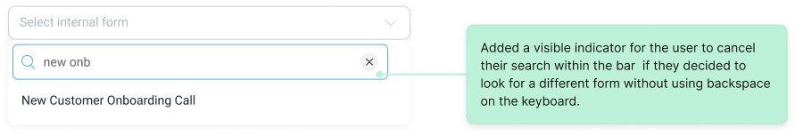
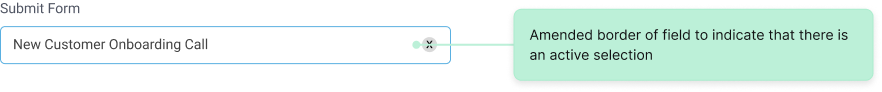
My final draft of the dropdown field includes a refined search functionality within the dropdown – a function that I saw was possible for the developers as the function is already available elsewhere within the platform.
State: dropdown expanded
State: search result
State: selected
Usability Testing
Designing a seamless integration
Knowing that I would be doing my usability tests with users on an established UI, I designed a high fidelity prototype to effectively test my feature integration. I drafted my usability brief, script and objectives and then began recruiting participants.
Aiming for 5 participants, I was only able to recruit 3 for my study
Recruiting participants turned out to be more challenging than I anticipated (even with an Amazon gift card incentive). Despite sending out several messages via LinkedIn and posting in a vibrantly active Facebook group of users, not many were willing to give up 30-45 minutes of their time for a call.
I was only able to recruit 3 participants for my study. However, considering that I am also a user of GoHighLevel, I knew I had considerable insight myself on how I as a user navigate and use the software.
Key findings
When tasked with creating a new internal form, users navigated to where the web forms (an already available feature) was kept. I had assumed it would be confusing to access the new feature here, turns out I was wrong.
2 out of the 3 users mentioned that accessing the feature from the sidebar in the contact record would be helpful, as “that’s where the actionable items were”.
Despite 2 out of my 3 users being very advanced technical “super” users of the software, they saw how helpful this functionality would be, saying “I don’t think it’s for everybody” but that they could “create a process with little chance of their clients messing it up, keep it idiot proof” (direct quote).
Based on feedback from the usability studies I also added a tooltip in the popup for the internal form to provide additional context for users who are slower to understand the difference between the use cases of an internal form vs a web form.
I also added an additional access point to the feature within the contact record UI (see below). My initial design only provided access to the feature within the first column, and based upon user feedback it quickly became apparent that the third column was a helpful location to access the action features without scrolling down the contact details.
Next Steps
Metrics I would love to measure
The real test of any new feature lies in how it performs. The feature had a positive response to it during usability testing and participants expressed the likelihood of using it, however this would need to be tested and confirmed when implemented.
Metrics I’d have liked to track if this design had shipped:
- Adoption rates/user engagement with the internal forms
- Error rates
- Conversion rates, to see a percentage of users who successfully complete a form after viewing it