The Credit Score Fix – 2022
Design and build of a sales funnel, managing and executing the process end-to-end.
The Challenge
A client-led problem, in which he wanted to productise his knowledge to serve his existing audience. My client often found himself repeating his teachings on how his audience could improve their credit score, and therefore he wanted to create a profitable resource that was able to operate without him.
Goal
Strategise the best features & benefits for an online product, then design and build a fully automated sales funnel and membership area. Success will be measured by conversion rate.
Background
My client Byron is a serial entrepreneur who has previously released books, courses and membership programmes. Over the years he has built up a long-standing relationship of trust and authority with his audience, including his followers on social media. He had shared his credit score teachings on YouTube which had proved so popular that it was often a topic of conversation at his events and within his network. Being the entrepreneur he is, he wanted to productise this knowledge somehow.
Research
Sense checking client's idea
Every good idea will stand up to scrutiny, so my first priority was to essentially “sense check” what my client wanted to achieve. His initial thoughts were to create a course, but was that ideal for his end users?
I needed to first establish how big of a problem this was, and how people were currently going about solving the problem of having a low credit score.
I dived into quantitative secondary research.
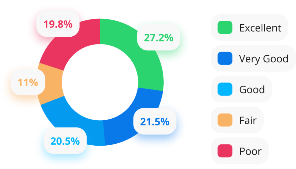
In my research I learned that a fifth of adults* see their applications for credit turned down.
Of those adults, one in 20 said they had been turned down on three or more occasions.
The ages for those experiencing credit refusal were mostly18-24 year olds (36%) and 25-34 year olds (35%).
Londoners were the likeliest location within the UK (31%).
Parents or guardians (30%) were also twice as likely to be declined as those without children (14%).
* Based on a survey carried out by Ipsos on behalf of the Money and Pensions Service (MaPS)
38% wanted tips on improving their credit score
Those within the 300 to 549 range report their poor credit history has impacted their housing, careers and relationships.
26% would value information on finding alternative forms of credit
What educational products already exist?
After establishing that there was an audience/market with this problem, I wanted to know what courses, workshops, templates and other educational content was available. I focused my analysis on the features and UI of competitor products.
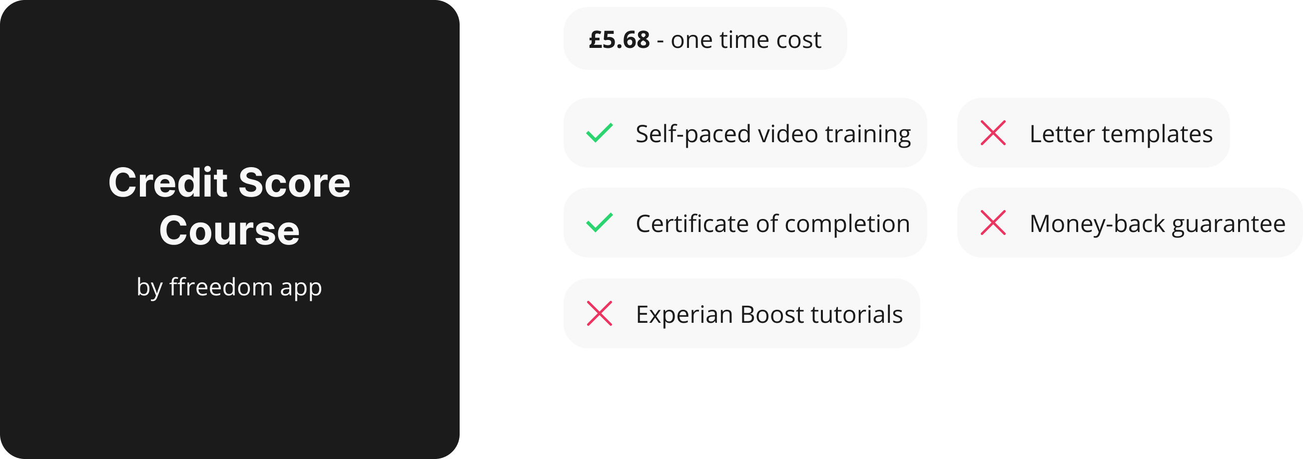
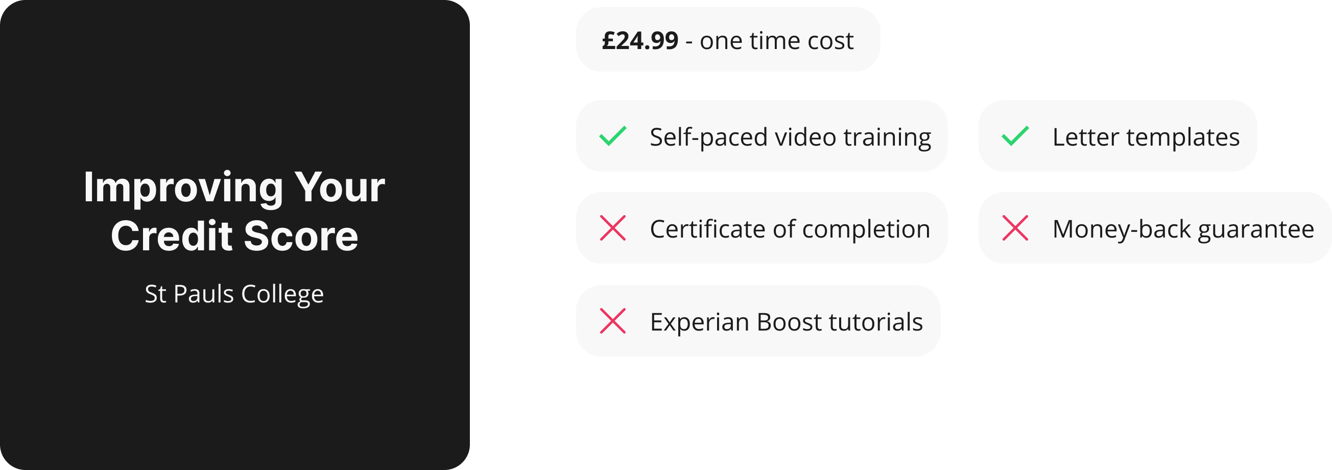
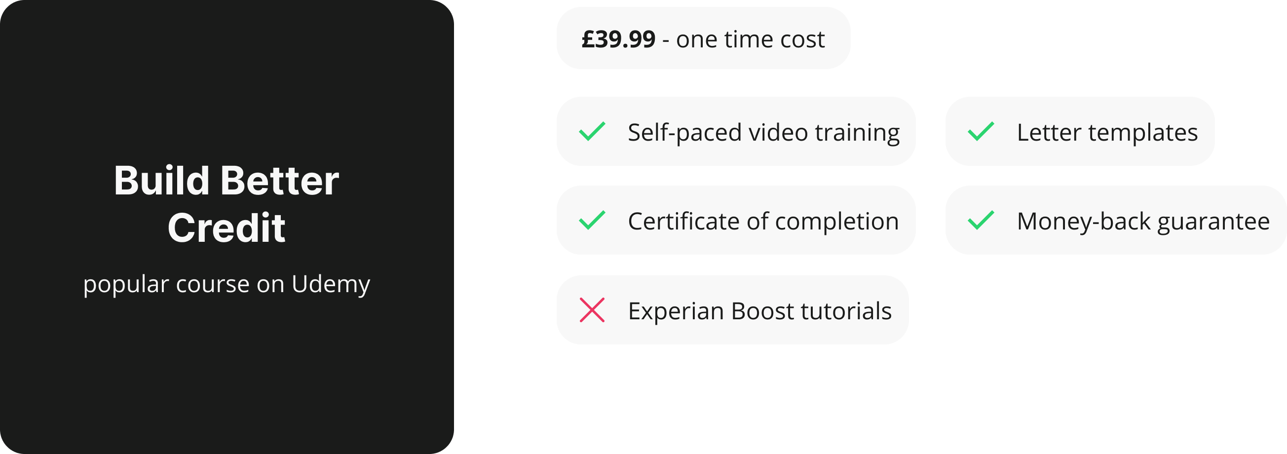
The above exercise was a turning point for me during this research phase, as my findings showed me that not only was there a user problem (poor credit score), there were products out there that helped users solve their problem.
What are users searching for?
Seeing that other course products already existed was a promising indicator, but I had no way of knowing if they were any good – or if they were indeed solving the problem that the market is trying to solve.
I delved further into quantitative research to understand exactly what problems the user is currently searching for to solve.

This exercise primarily helped me understand the keywords the market were searching for, but it also helped to sow the seed of a few potential ideas for features and benefits we were to include within my client’s products.
Problem statement
Every adult has a credit score which affects, influences and impacts any financial decision they make. Those with a low score struggle to receive credit when applied for, which can negatively impact their living situation, career, mental well-being and (if not fixed) their future overall. Our target market of users experience this due to previously made poor financial decisions, and it’s important that they are educated on how to make better decisions in the future and how to fix their existing score to achieve their personal goals.
Define
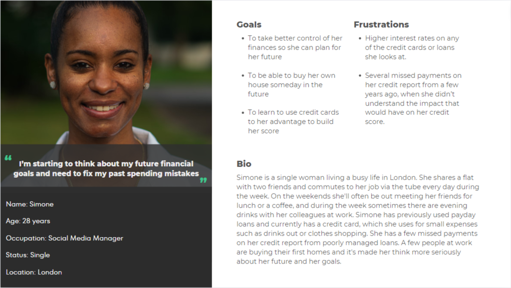
Allow me to introduce you to our ideal user, Simone
Based on my research I created a persona that is reflective of the typical user for my client’s product.
Levels of awareness
From a marketing perspective it’s always important to establish the market’s level of awareness, following the popular framework from Eugene Schwartz.
After discussions with the strategy team and my client, it was agreed that our user is Solution aware. This knowledge helps our copywriter frame the marketing argument on the product/sales page.
Our user needs to be Solution aware, as this indicates they are aware that they have a poor credit score and are actively searching for tips, tricks and methods on how to improve their score.
What is the best digital product type to create?
There are a multitude of ecommerce formats for educational content, so which is best here? My research told me that users who pay for solutions are looking at courses. Live workshops would be a viable option here too, however when considering my client’s goals of the product being instantly available without his attention, so that wasn’t a suitable option for his business goal.
My client had indicated that in the future he would like to run paid adverts to the product. It was this fact which influenced my design team’s decision to create an SLO (Self Liquidating Offer) funnel.

An SLO funnel is designed to offset the cost of advertising (e.g Facebook, Google etc). The funnel has three products and the sale of the first (primary) product is to recoup cost per click.
Profits are made on the sale of the order bump (displayed at checkout) and then the one-time-offer (displayed after submission of payment details). The product is delivered immediately upon purchase, which in my client’s case will be login details to a password-protected area containing his training.
It ticked all the boxes:
Gave users the power to only buy what they need
Is delivered automatically, without any involvement from my client
Creating an irresistible product
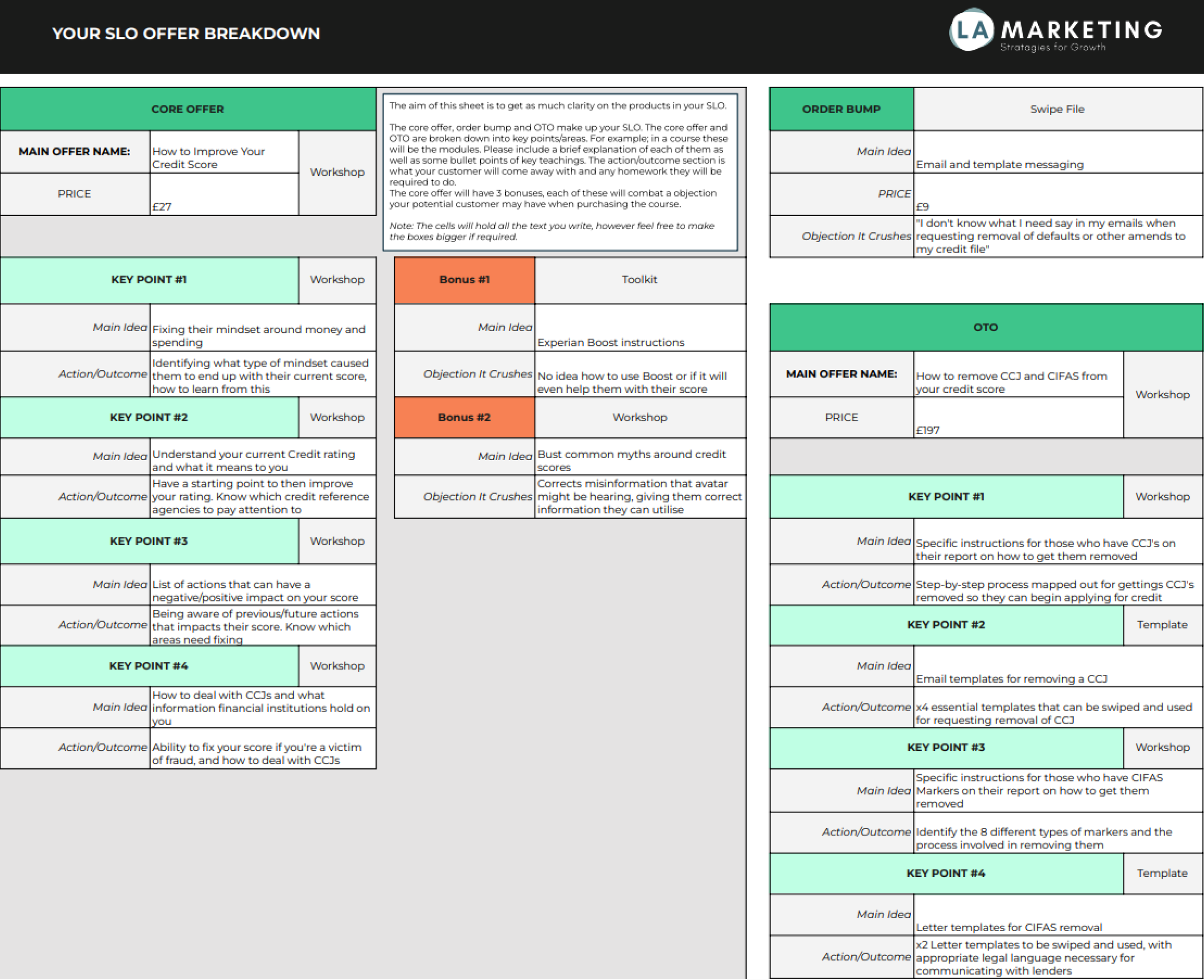
Taking the key pain points from my previous research I then brainstormed with stakeholders the potential key features and benefits that would make my client’s product better than the other available courses on the market.
We finalised on the following details:
It was a strategic decision to use the letter templates as the order bump, as we agreed that this setup would push the conversion rate.
I shared this product information architecture with my client so he knew what content he needed to create for the automation.
Design
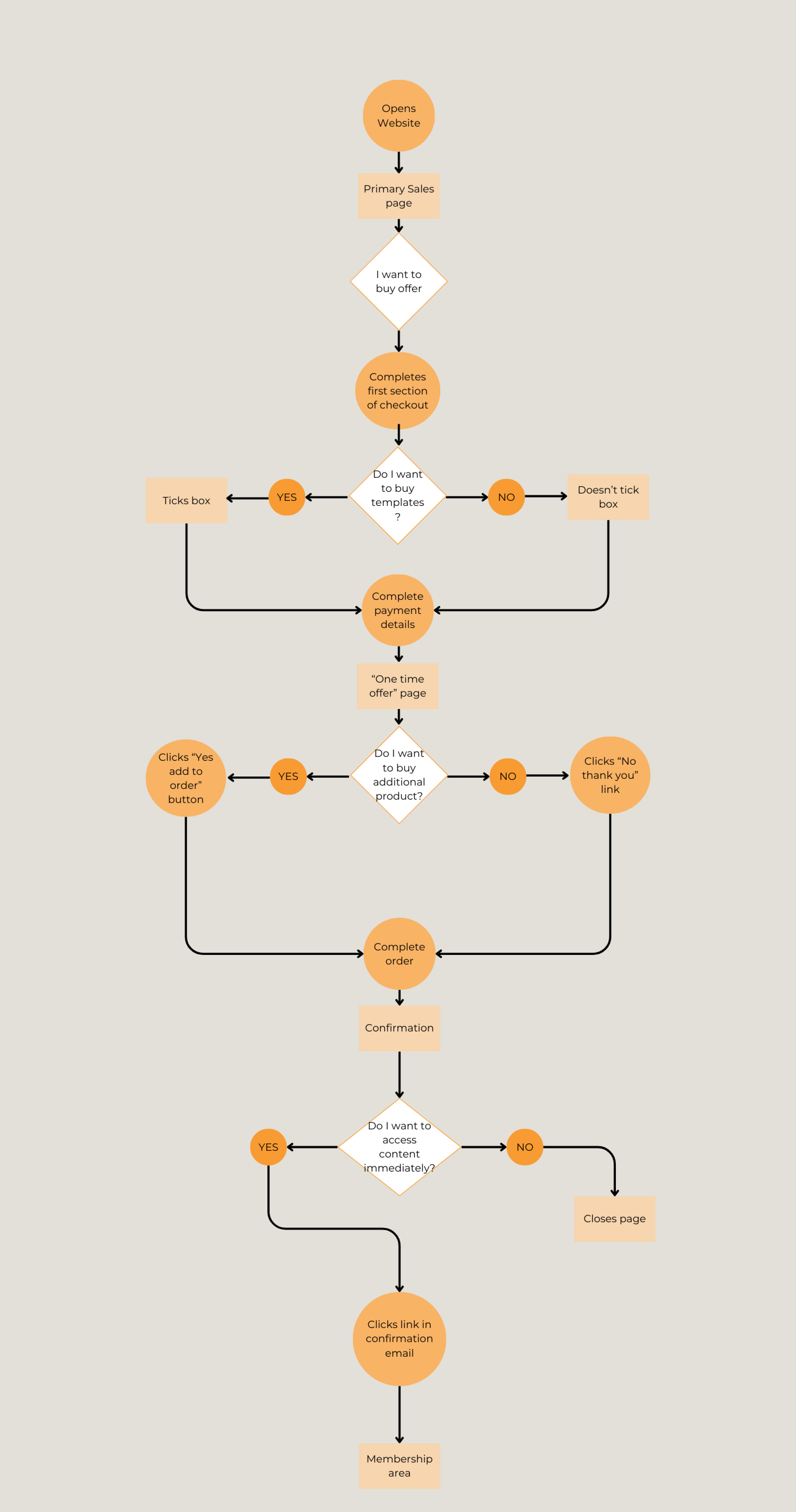
Mapping out Simone’s journey through an SLO
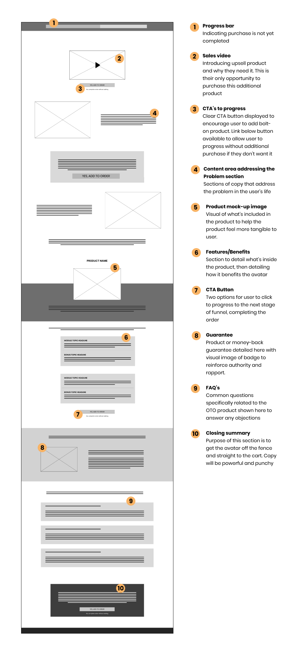
I mapped out the user flow of the buying process to help ensure the designs will meet user’s needs and expectations, and to assist with informing stakeholders of what the user journey will look like.
Doing this exercise helped to highlight a potential friction point that would have been missed, as I hadn’t thought to consider exactly how the user would progress to the end of the journey if they didn’t want to add the additional upsell product to their order.
We were ready for wireframes
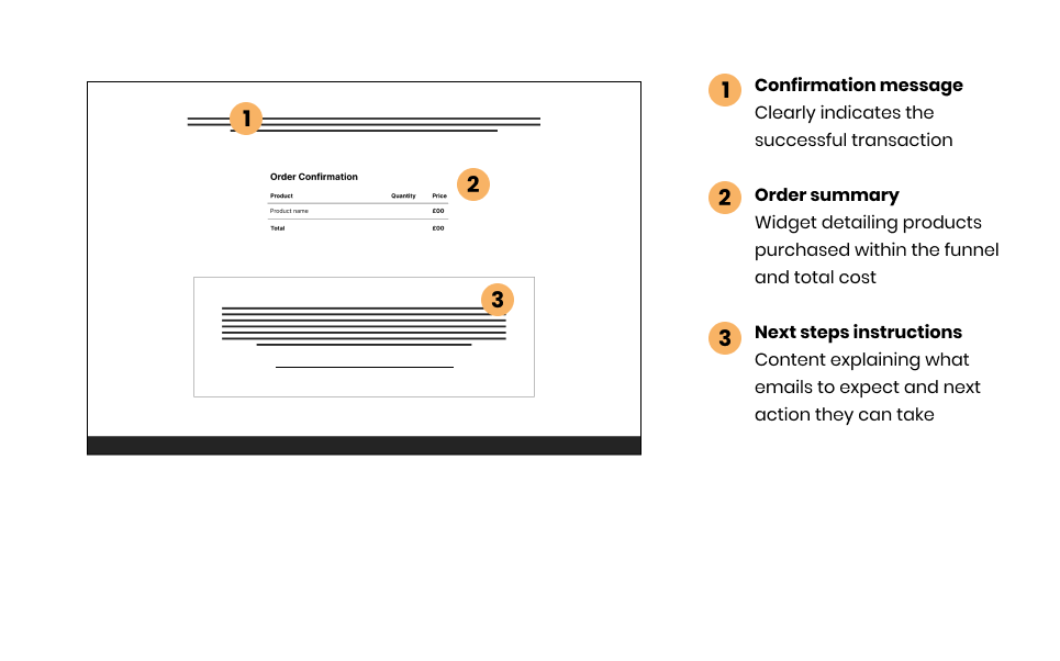
I then got to work creating rough wireframes for the sales page, upsell (one-time-offer/OTO) and confirmation page. We had agreed our tech stack internally (and with my client) after the Research phase was complete; we were going to use 3rd party software to host his membership platform that users would log in to so they could access the product.
To ensure a smooth & cohesive transition for the user, the appropriate use of branding throughout the purchase and login flow was imperative.

Bringing the wireframes to life
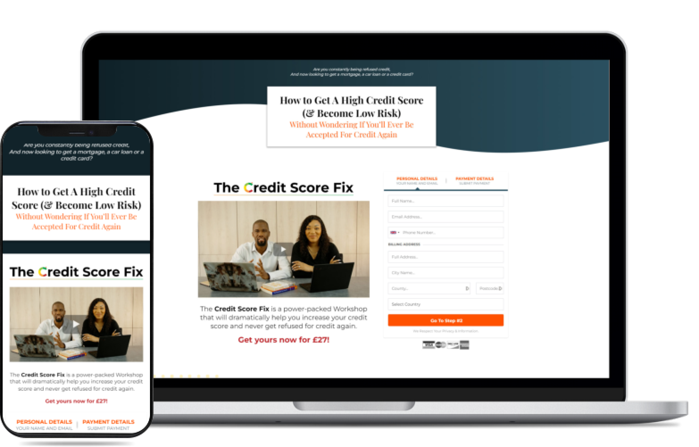
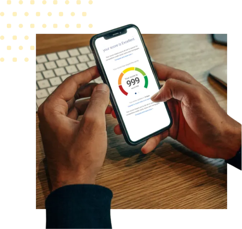
I wanted to emulate a style similar that which was somewhere inbetween popular credit score websites Experian and ClearScore, to instil a sense of authority and build trust with the user.
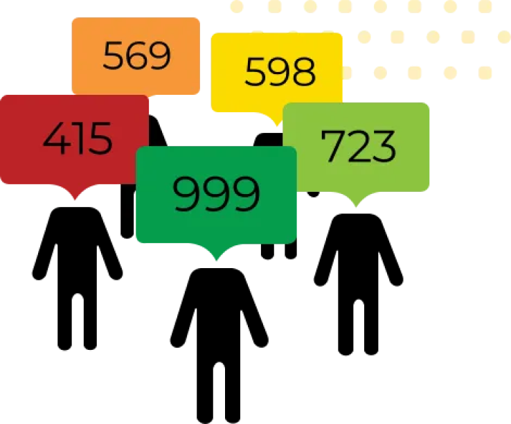
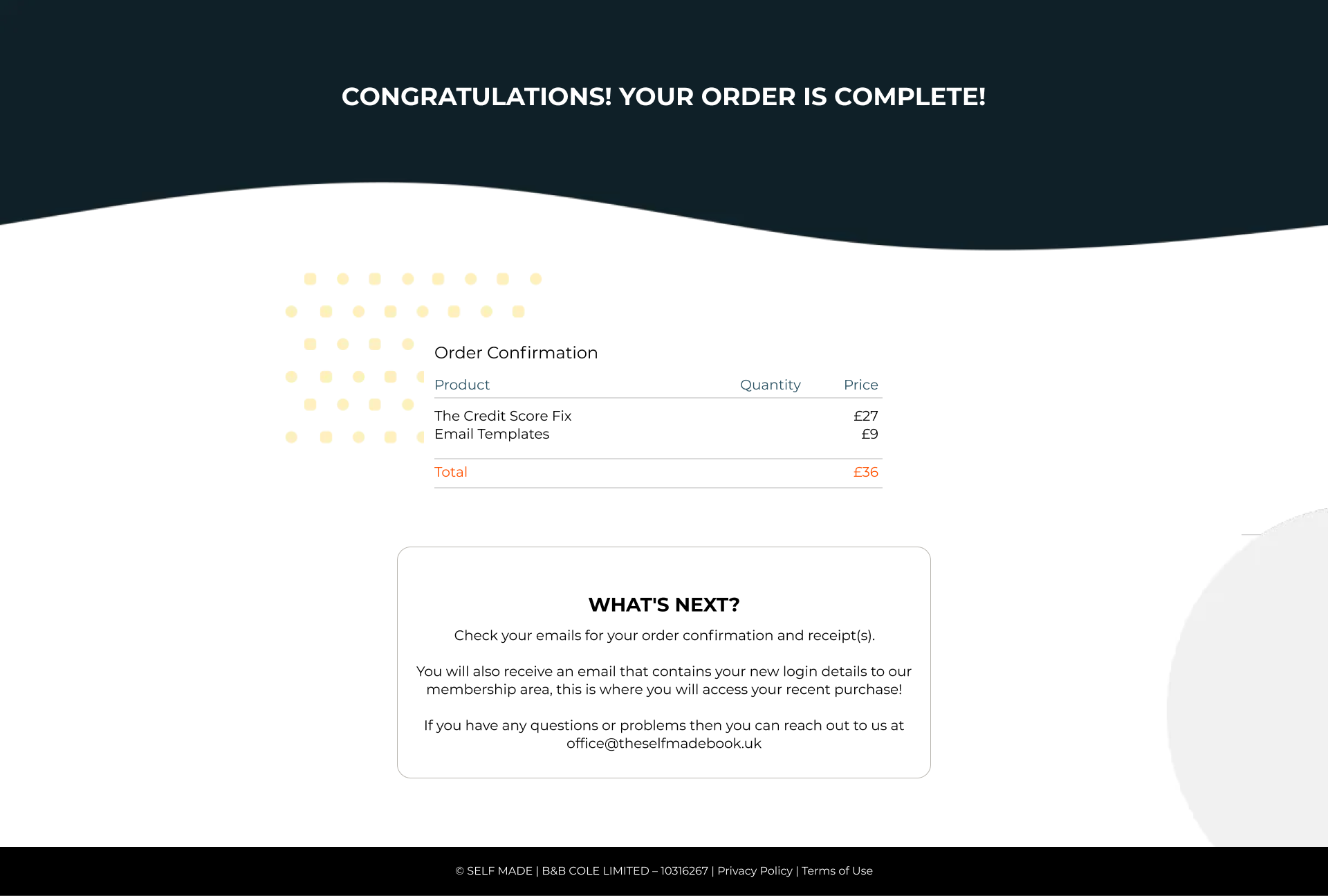
I created the following image assets to support the design:



Testing
Conducting a usability test
It was at this stage of the project that the deadline had been pushed forward, so in the rush of bringing this project closer to development and completion. I made the decision to do guerrilla testing for speed and ease. I explain more further down in the Measuring Success section as to what I would have done differently.
This wasn’t an ideal situation at all but it still managed to give us the insight we needed. I tested with 5 participants.
Goal 1: Test overall flow for users completing the purchase flow
Goal 2: Test time on task for how long users completed purchase flow
Goal 3: Identify any existing “stuck” points within the user flow
Goal 4: Uncover any desired changes that users may like within the flow
The results
Goal 1:
Test overall flow for users completing the purchase flow
4/5 Users said the flow was straightforward and simple
5/5 Completed the flow without stopping
5 Users, average completion time of 4 min 10 sec
Goal 2:
Test time on task for how long users completed purchase flow
Goal 3:
Identify any existing “stuck” points within the user flow
3/5 Users said it wasn’t clear how to complete purchase without adding the OTO
3/5 users suggested that the order bump copy wasn’t very clear
2/5 weren’t sure what card types were accepted
Goal 4:
Uncover any desired changes that users may like within the flow
Key takeaways
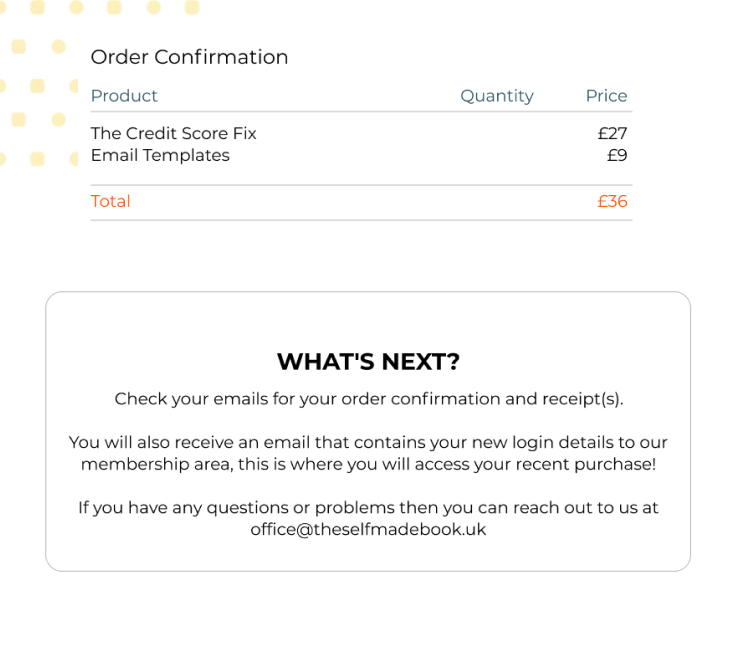
This particular user noted that the confirmation page didn’t give them next steps to access the material, and that it was frustrating to have to wait for the email.
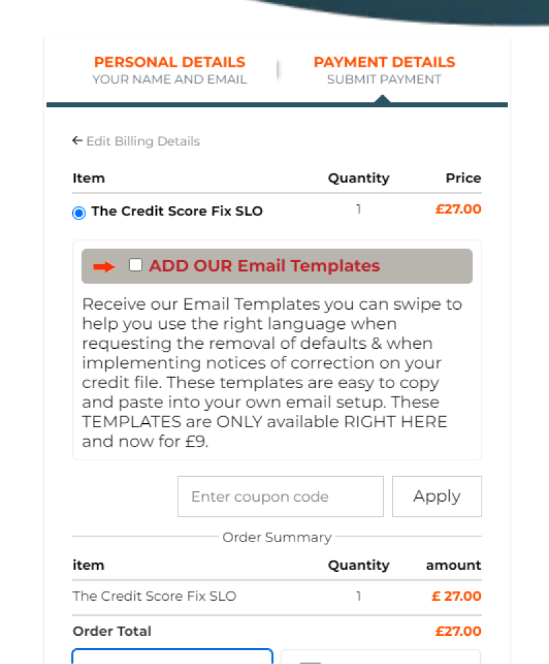
They commented that the price wasn’t immediately clear, or what the templates were for.
The checkout form didn’t have any visual suggestion to indicate accepted cards.
Design revisions made as a result
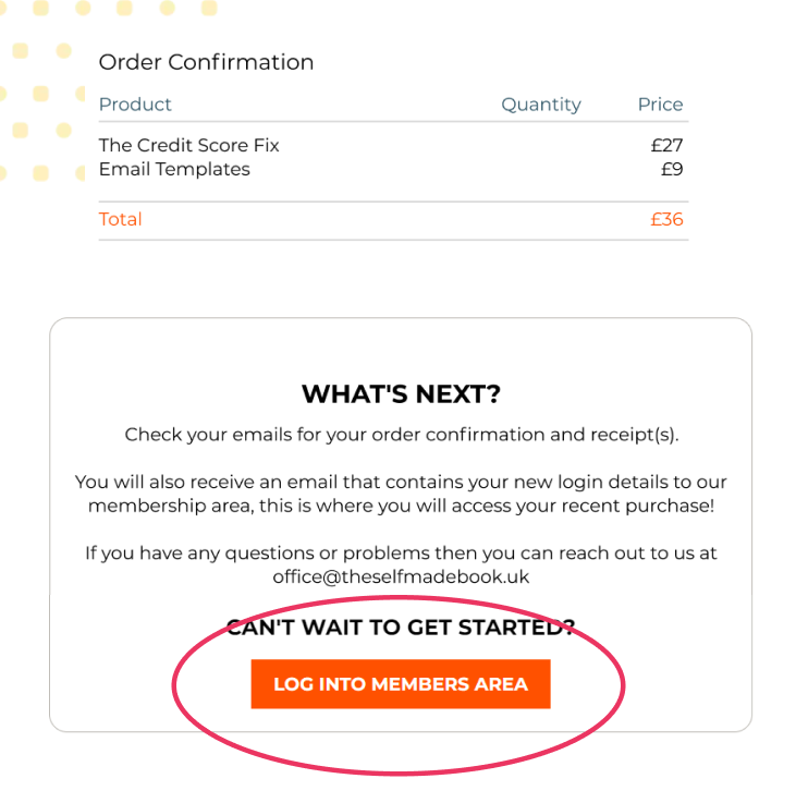
On the purchase confirmation page I added a CTA button that will take the user directly to the membership area, automatically logging them in. This meant that they didn’t need to wait until the confirmation email hit their inbox before accessing the content they had just paid for.
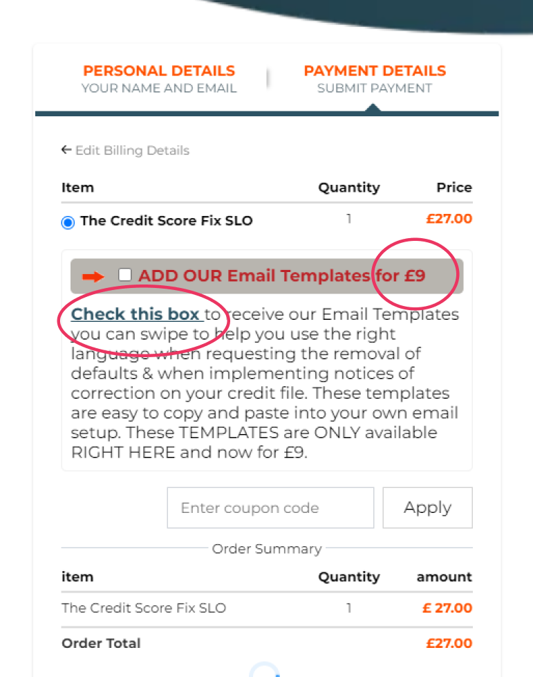
The sales page has a two-step order form, and it’s only on the second page of the form (where payment details are entered) that the order bump is displayed. After the usability test I amended the copy slightly to provide more clarity on price and what the user needed to do if they wanted to add the order bump.
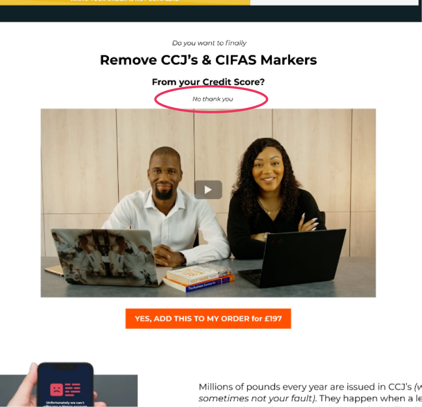
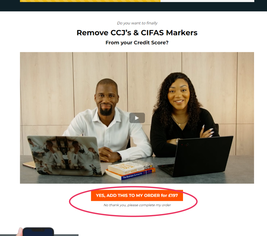
The link that enabled users to decline the OTO offer was not clear so I amended the text to now read “No thank you, please complete my order” and moved the text to be below the button so it was located where the eye is drawn to.
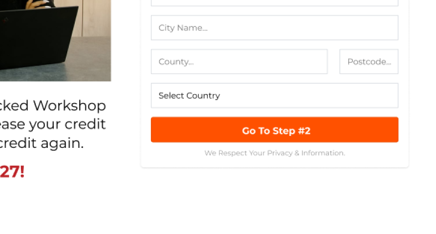
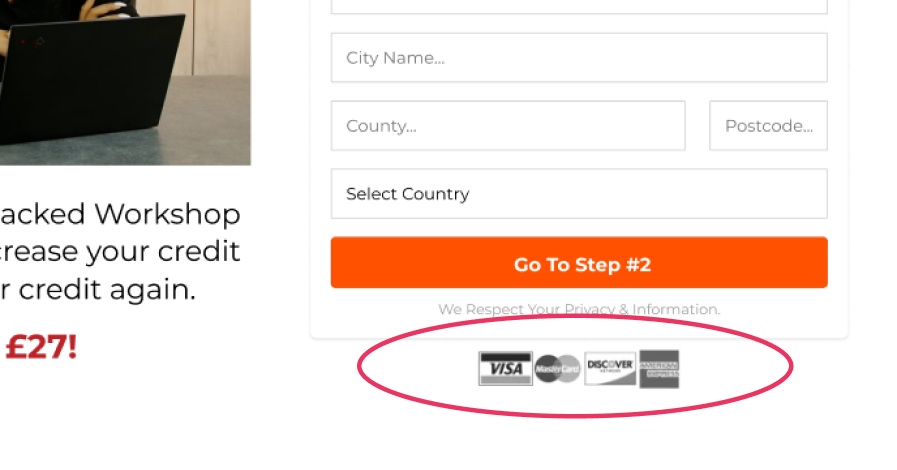
To reassure the user of what card types were accepted for payment (and to instil an additional sense of trust on a subconscious level) I added the logos of accepted card types under the checkout form plus any other CTA buttons located elsewhere on the page.
Final UI
Would you like a guided tour?
Below is a video where I walk you through the user flow of the sales funnel, from the sales page to the membership area delivering the membership area. This is a fully functioning sales funnel selling 3 products, with automated email follow-up.
Measuring Success
What do the KPIs say?
At the very beginning I set out to measure success via the KPI’s of the sales conversion rate of the sales page, order bump and OTO (one time offer). As Byron did a soft launch to his list and following we monitored and measured the funnel for 6 months.
Here’s how that went:
Sales Page
Conversion Rate
Sales page is converting at 6% (unique views vs units sold). The industry average stat for this KPI is 2-3%.
Order Bump
Conversion Rate
Order bump product converted at 77%. The industry average stat for this KPI is 30% so this was phenomenal.
OTO
Conversion Rate
The industry average stat for this KPI is 10%, so although this was almost within range, there’s room for improvement.
Within its first 6 months this funnel generated £5.6k with organic traffic!
Soon this funnel will have paid traffic directed to it.
The good, the bad and the ugly
This wasn’t the smoothest of projects and there are many things that, upon reflection, I would do differently:
The deadline for the project was pushed forward which meant that the testing stage was rushed as the agency needed to get this project across the line. In an ideal world I would have preferred to have been more thorough with testing, using a moderated (and recorded) usability test with the targeted audience.
Our choice of software for the membership platform meant that I couldn’t truly flex my UX fingers when it came to customising the onboarding process (post-purchase). There is a set process that the software has pre-mapped which meant my only influence was styling and branding the content area.
The headline font Playfair Display doesn’t work well, it feels very disjointed from the rest of the design, I believe I could have done a better job communicating this discrepancy to the client.
Although the project met the KPIs and is (on paper) considered a thriving success, this project also came with many lessons learned. This project gave me a fantastic opportunity to learn how to deal with multiple, often competing timelines, and deliver work that satisfied not only the business needs but also the needs of its customers.
Next Steps
What now?
My client plans to eventually run adverts to this funnel.
If (or when) he decides to run adverts then the next steps for this project would be to monitor the stats weekly and monthly, including heatmaps and screen recordings (using software like Hotjar) to inform me how users continue to engage with the funnel. I would then reiterate and continue monitoring.
