Brave & Determined Charity – 2023 / 24
Improving website conversion rate by 29%
The Challenge
Users of the BADCo website had previously complained that finding specific products and pages was difficult, which was leading to poor conversion rates. This is a problem because it meant the charity is likely missing out on revenue.
Goal
For the website to easily allow visitors to locate and browse & purchase products within the site, making their path to purchase friction-free. Success is to be defined by an increase in conversion rate and a decrease in bounce rates.
Background
BADCo are a small local charity who provide funding for early intervention life-saving counselling sessions. To do this, they rely on selling branded clothes and accessories via their website, charity events, markets and donations. Until now, they had built the website themselves and didn’t know how to make it look more professional. The charity is now getting good traction and they were conscious of how their online presence didn’t reflect their progress.
Research
Kicking off with a Competitive Analysis
To gain a better understanding of industry standards, I analysed the features and UI of competitor sites (focusing primarily and specifically on charities that sold clothing online).


Although the purpose of the above charity websites all differ, when it came to evaluating the ecommerce aspects of the websites it stood out to me that majority of them included a “best seller” or “collection” product category highlight on the homepage.
BADCo’s business mission is to increase product sales to feed their profits.
Bringing the products to the forefront of their homepage in some way would aim to increase site retention and ultimately be a contributing factor for conversion rate increase.
Reviewing the ecommerce giants
The above charities were still relatively small in terms of site traffic – and likely sales. I decided to further research how the sport giants of ecommerce websites structured their navigation and presented their products.
As BADCo’s clothing range is athleisure and everyday wear, I reviewed the following websites that sell similar products.


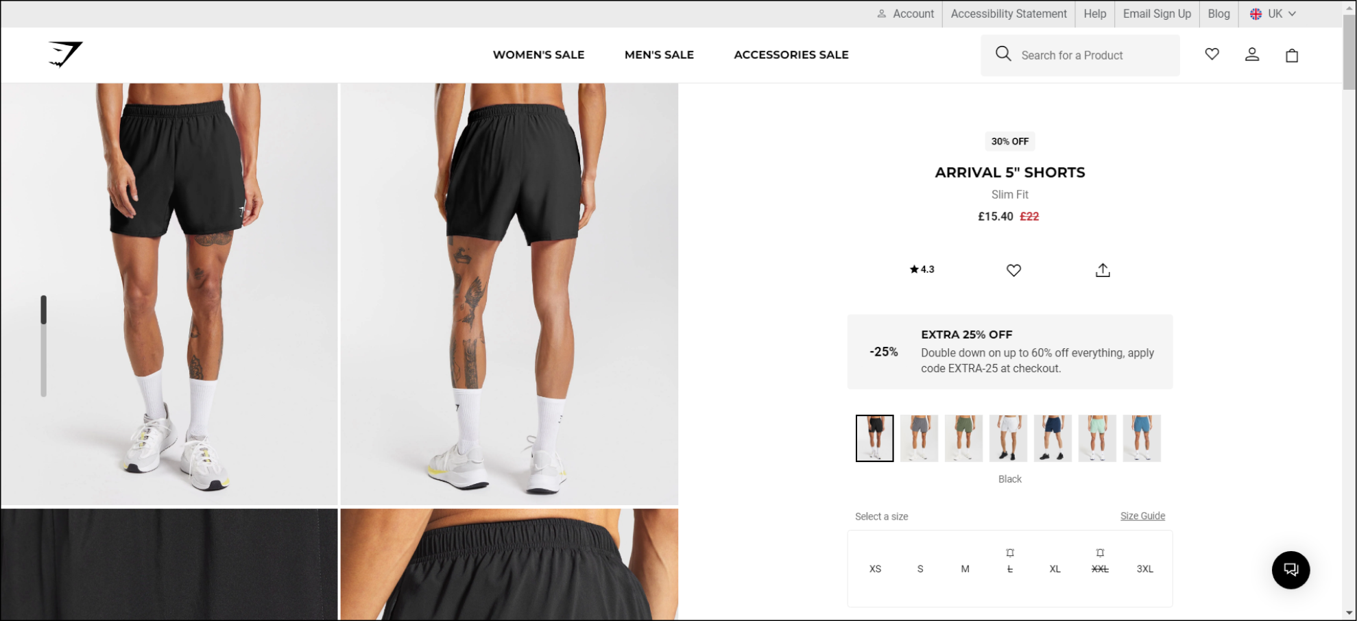
A clean header with a lot of information. I liked how they incorporated the free shipping into the header without it making the busy header too cluttered.
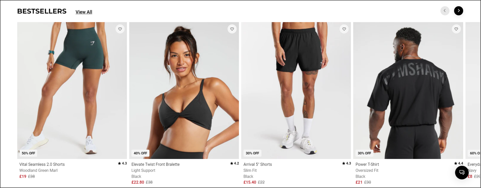
Their homepage includes a slider which displays their bestsellers, providing the user the ability to hover over the product and do a “quick add”.


JD Sports had a very clear menu structure in their header and I liked their use of yellow for grabbing the users’ attention, however I felt that their repetition of product categories below made it appear too busy and distracting.
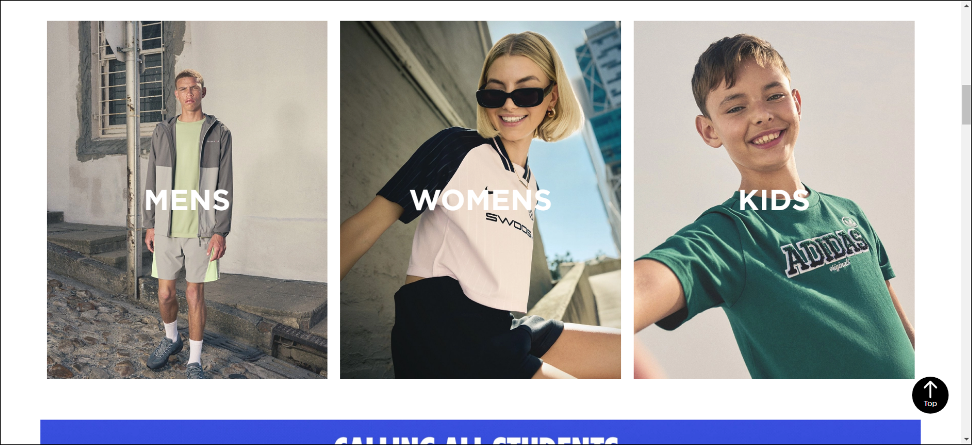
As you scrolled down the homepage JD Sports displayed the top-level category cards. The visual break stopped me in my scroll, as I liked how they had visualised the categories, making it immediately clear what the categories were.
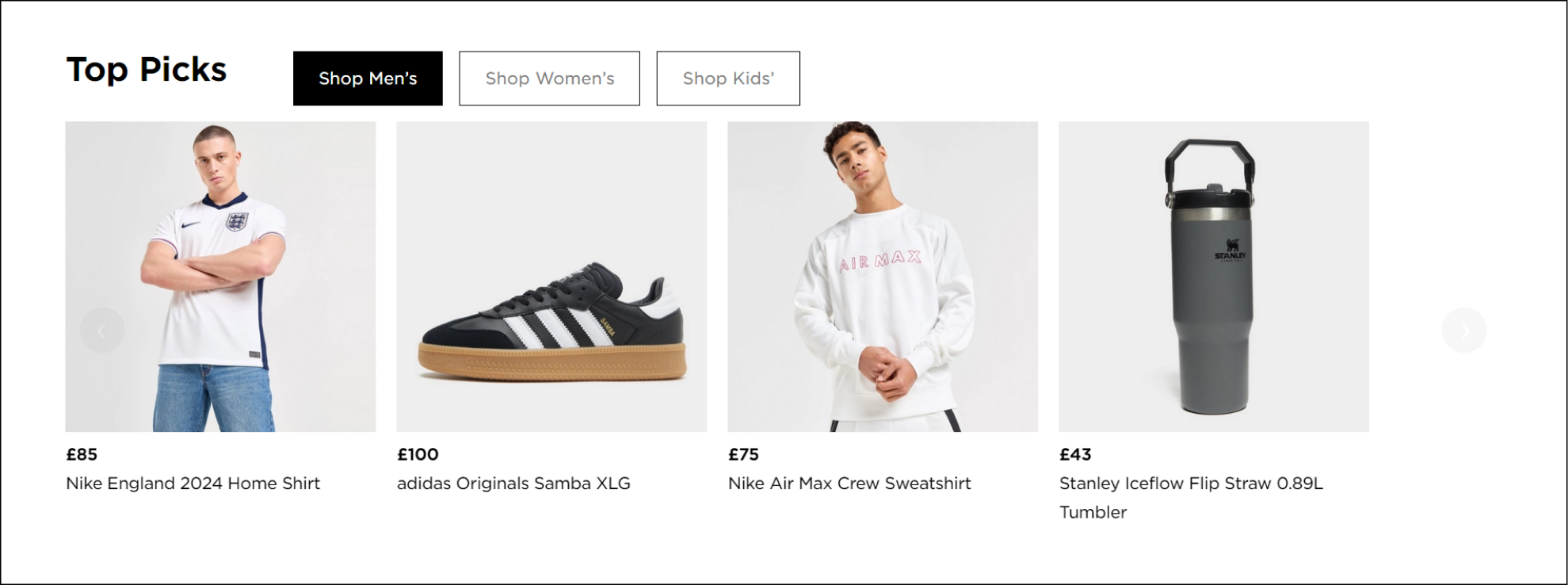
Further down the homepage, JD Sports had included a section highlighting “Top Picks” products. As a user, I was able to toggle between Mens, Womens and Kids which enabled me to filter the products to my preference.
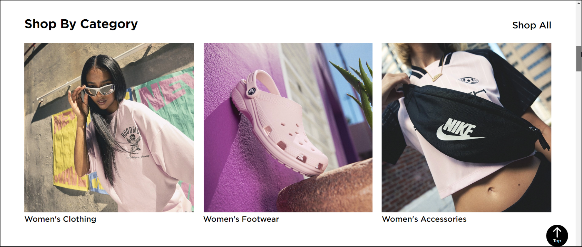

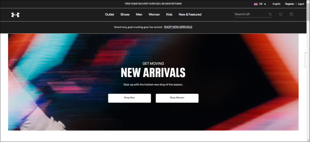
This research did bring awareness to a few opportunities and ideas that I could incorporate in my redesign. They included adding a prominent banner about the free shipping threshold, incorporating a “quick add” feature and how to better visualise the categories.
Currently the BADCo website has all of its products displayed on a singular index page which is reportedly causing a lot of frustration for their users.
Define
Now to dial in on who our ideal user is
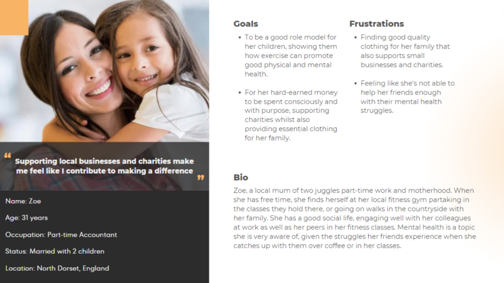
I created a persona that is reflective of the typical customer for BADCo’s website. Let me introduce you to Zoe, a conscientious mother who is aware of how mental health can affect her loved ones.
What information is Zoe currently presented with?
In order to unravel the information and content on the current BADCo’s website I created a visual sitemap.
Sitemap before:
Let's get digging
In my audit I found that there was a lot of unnecessary and confusing information crammed into pages which overwhelmed the content, as well as several inconsistencies across the design.
Their “Shop” page displayed all of their products at once which was overwhelming for visitors to look through, especially if they were sifting through the filters for something specific.
The “About” page contained information about the founders, which was then followed by the mission statement of the business. This felt backwards and disjointed, I knew this information needed more prominent placement on the homepage, so new visitors knew exactly what the business is working to achieve and how they can contribute.
The homepage itself needed a complete re-structure, as the hero section was wasting important space above the fold by repeating the logo and mentioning the podcast; neither of which met the goals of the business for raising money.
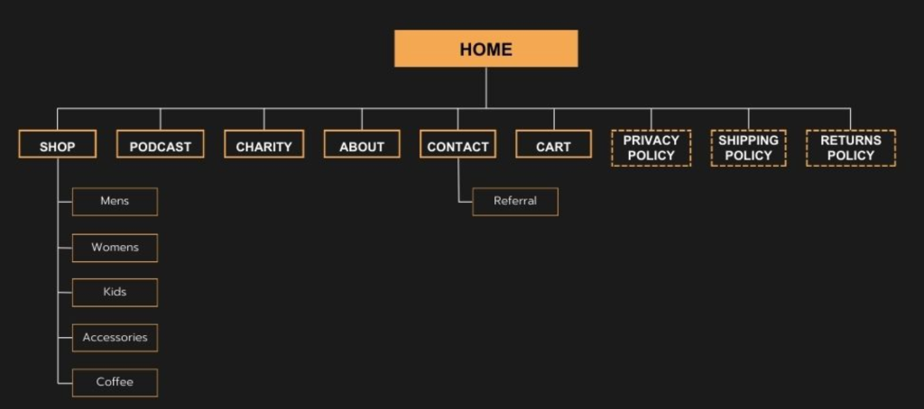
Sitemap after:
After analysing the existing information architecture and discussing with the client what additional information they wanted on their website, I prioritised, simplified, and restructured the information to create a new sitemap.
Creating a more fluid, natural browsing experience
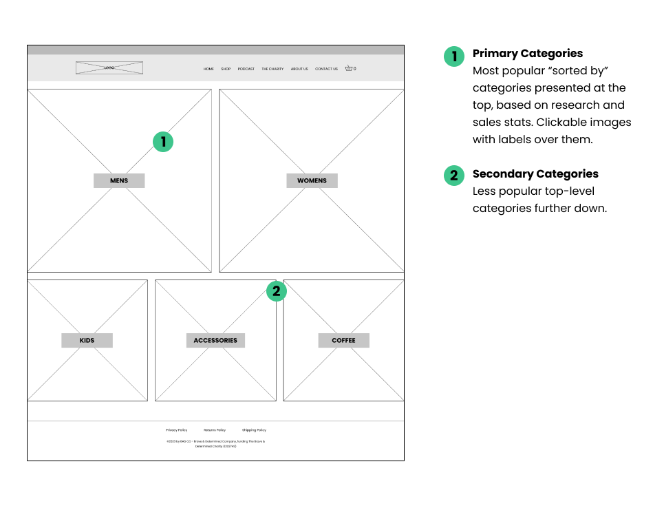
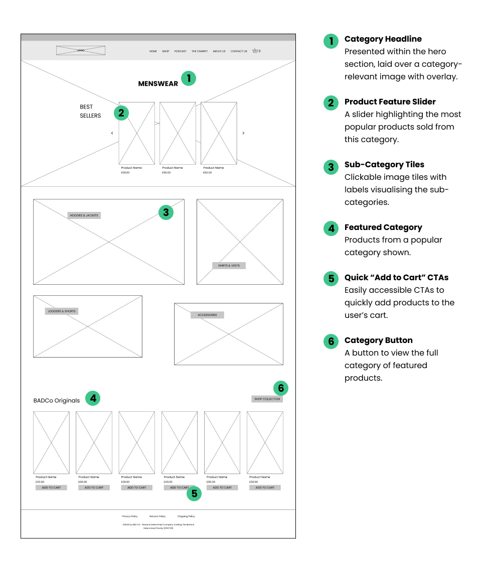
I plan on introducing top level product categories of “Mens”, “Womens”, “Kids”, “Accessories” and “Coffee”. This will bring the product browsing experience in line with other popular ecommerce sites, so users are more familiar with the structure.
There will be a new “Charity” page which is where valuable information such as mission, vision and values will be shown in more detail, linked to from the homepage and the main menu.
I also thought it would be helpful to create a process for those who are looking for help with funding and counselling, as although the primary site users were shoppers, there are also those who are seeking help from the charity themselves. To channel those visitors to a new referral form will help the charity manage their inbound enquiries.
Design
How can we improve Zoe’s browsing journey?
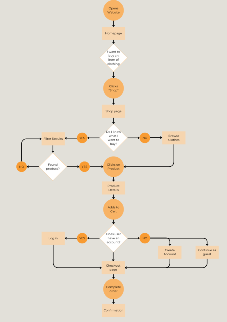
Keeping focus on the business goals of minimising bounce rate and increasing conversions, I wanted to prioritise the user flow of locating a product and adding to basket.
Here’s how I saw Zoe’s journey:
Time to crack on with the wireframes
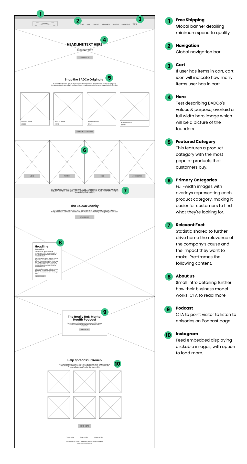
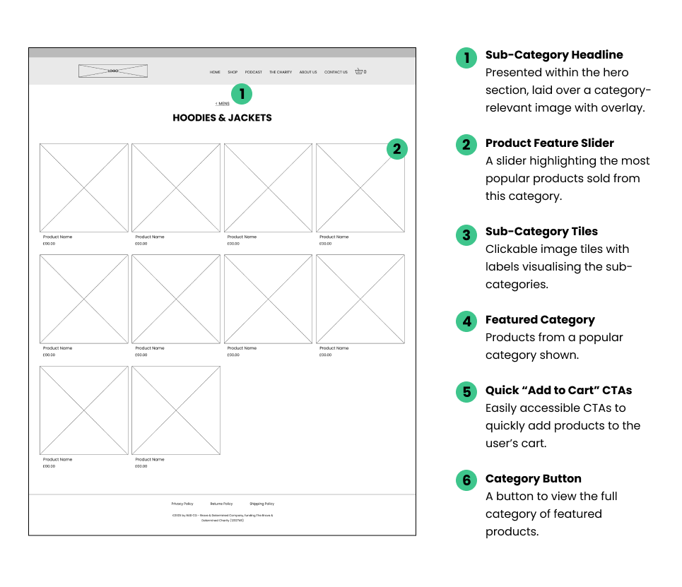
I kept my primary focus on the pages that are visited in the user journey flow (shown above) which includes Homepage, Shop, Primary Category, Sub-Level Category, Product Page.
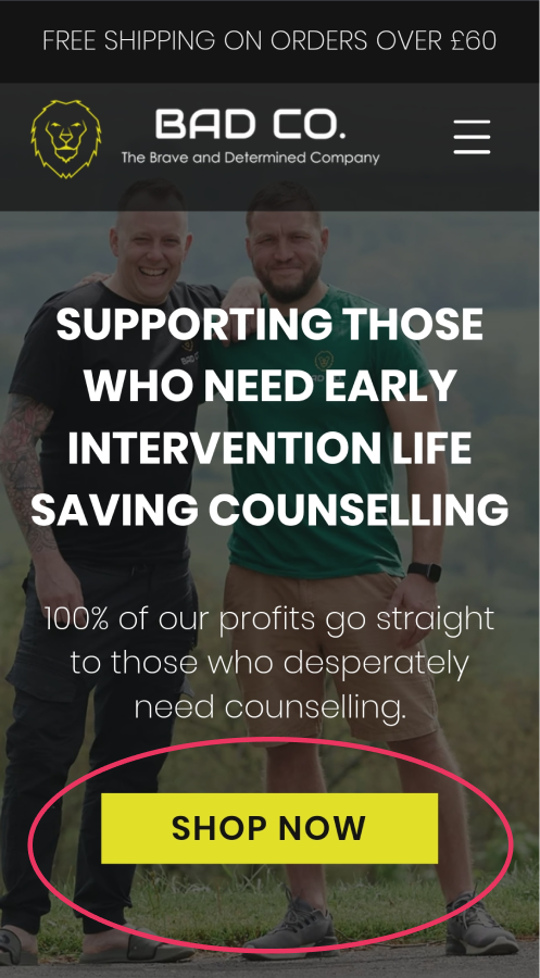
The homepage needed to have clear CTA direction and messaging. Understanding that the BADCo business incorporates an ecommerce site, the images of products needed to be more prominent and impactful.
Bringing the wireframes to life
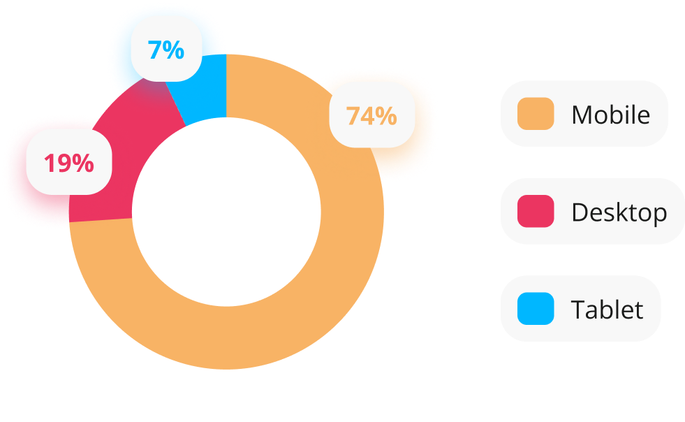
I analysed BADCo’s existing traffic data on their Wix platform to confirm what the most popular types of devices were used to view the website.
Surprise surprise, mobile came up top trumps.
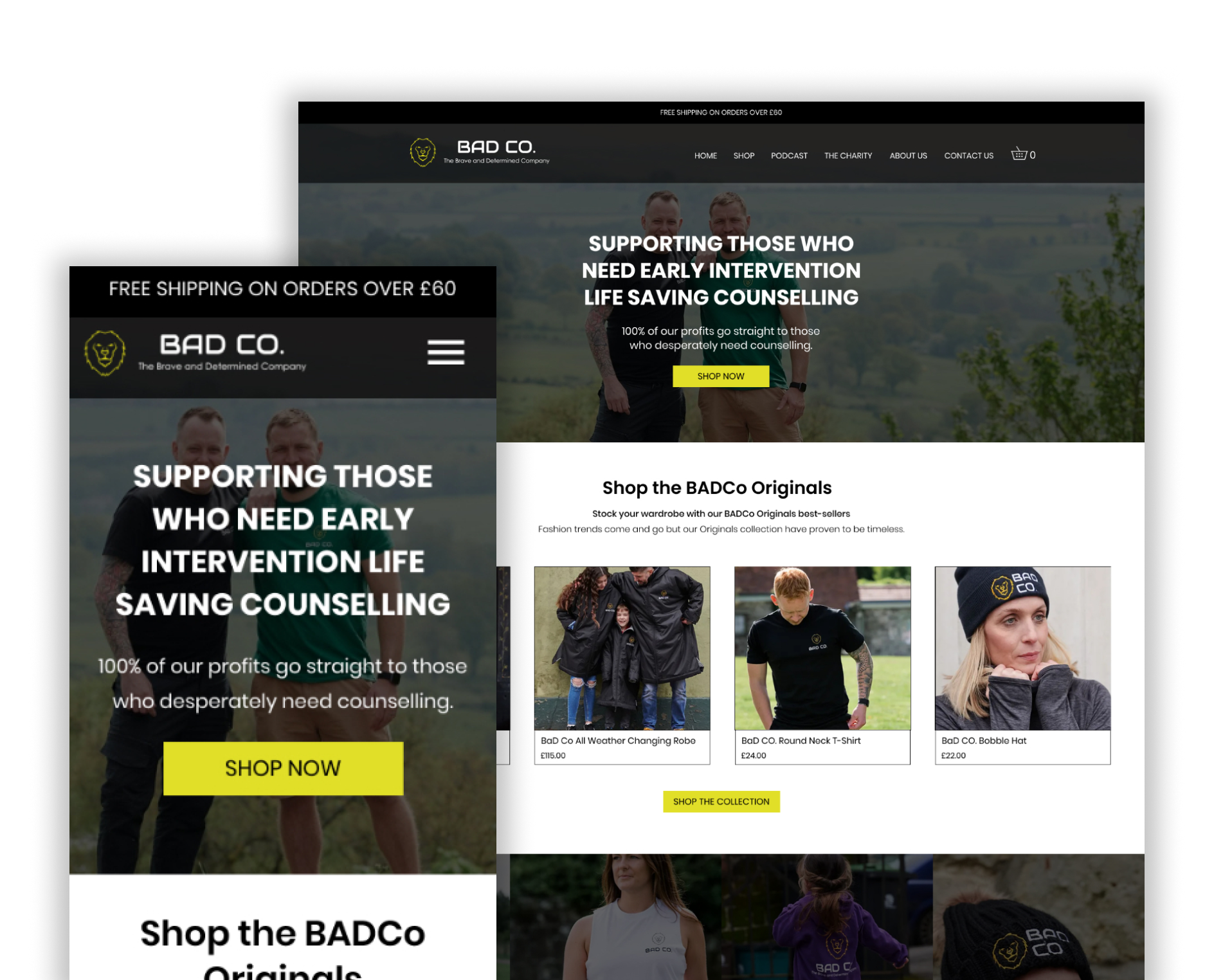
To ensure the website was resilient across devices, I designed my key focus pages in both desktop and mobile view.
Now, BADCo had already established a branding palette, albeit a minimal one.
I thought I could use their minimal palette as an advantage, keeping elements minimal and modern. Their signature yellow used only on important CTA’s or (sparingly) on section breaks. Everything else is utilising black and white with clean lines, leaving sufficient white space to let the design breathe.
Desktop:

Mobile:

Testing
Conducting a usability test
At the end of the day, this project was all about the product purchase flow and the users that would be utilising it. I needed to be sure that my design was fully considering the needs of those users, so I decided to conduct some usability testing. I built a prototype of the shop flow using Figma and recruited 4 participants from my network to take part.
Goal 1: Test overall flow for users completing the purchase flow
Goal 2: Test speed at which users completed purchase flow
Goal 3: Identify any existing “stuck” points within the user flow
Goal 4: Uncover any desired changes that users may like within the flow
The results
Goal 1:
Test overall flow for users completing the purchase flow
4/4 Users said the flow was straightforward and simple
4/4 Completed the flow without stopping
4 Users, average completion time of 2 min 50 sec
Goal 2:
Test speed at which users completed purchase flow
Goal 3:
Identify any existing “stuck” points within the user flow
3/4 users wanted option to donate without purchasing
2/4 wanted the ability to add a note to the order
3/4 wanted additional payment option of Paypal
Goal 4:
Uncover any desired changes that users may like within the flow
Key takeaways
Design revisions made as a result
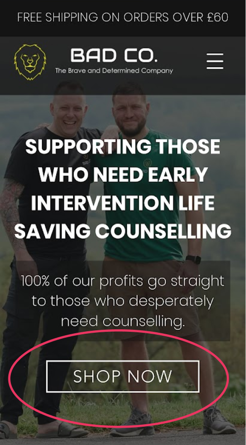
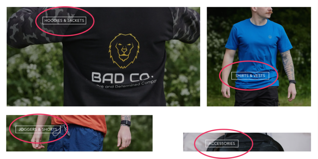
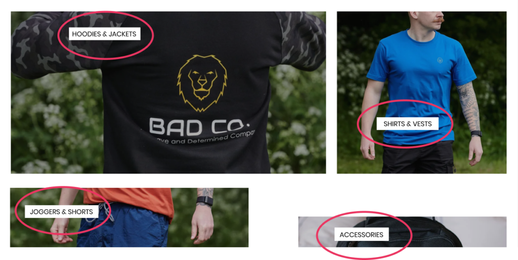
The same amend was applied to the top-level category pages (Mens and Womens) where the secondary categories were visualised. The buttons on these images proved to be the most difficult for the user to read.
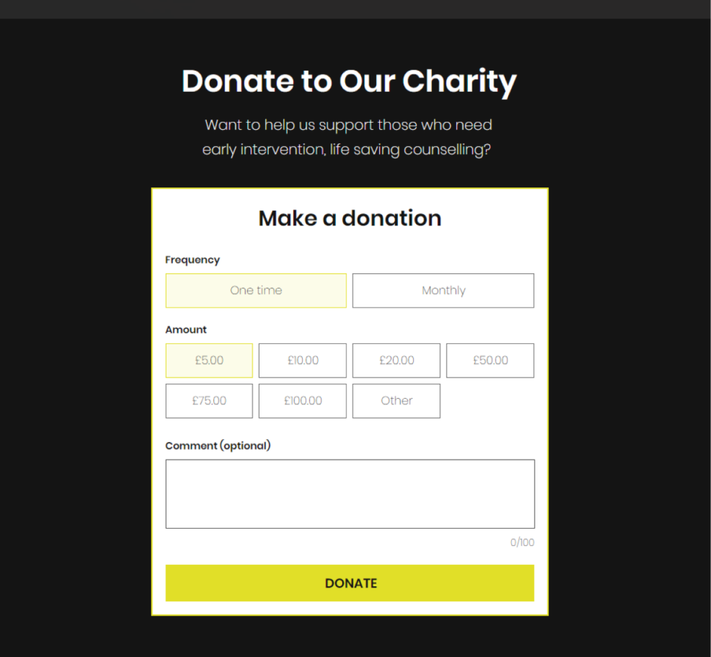
It made sense that a charity website had the functionality to allow its visitors to make a donation – something that seemed so obvious on reflection.
I created a new page designed specifically for those who were interested in donating and not purchasing something from the shop.
This page sits under the “Charity” page as a sub-menu item. It felt logical to me that those who were interested in the charity’s work and wanted to donate would look to the charity page. However I’m aware that is an assumption I have and if time allows in the future it would be something I’d consider doing a usability test on.
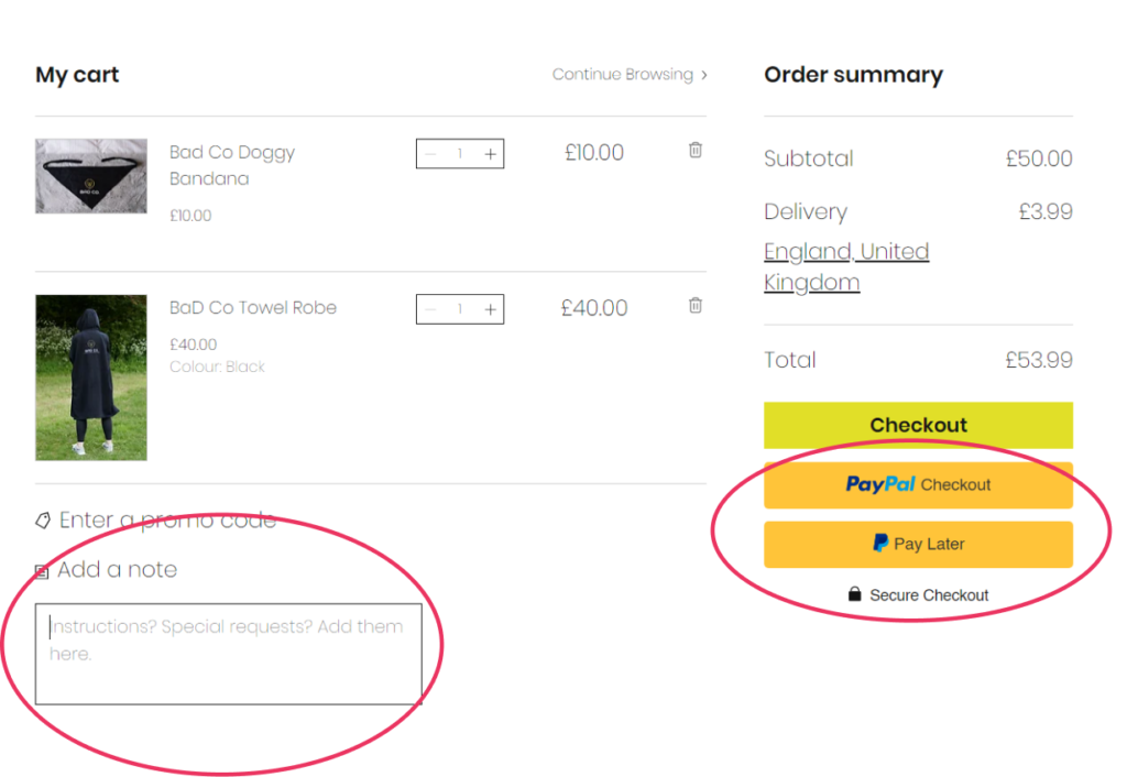
Based on user feedback I added the ability to add a note whilst viewing the Cart page. The text box will only display when the user clicks “Add a note”.
I spoke with the team at BADCo about incorporating PayPal and they were happy to include it as an option, so I’ve added them here on the Cart page as a payment alternative.
Final ui
Would you like a guided tour?
Below is a video where I walk you through the user flow of purchasing a product on the live website, where I provide a little extra commentary on a few other elements.
Measuring success
What do the KPIs say?
At the very beginning I set out to measure success via the KPI’s of the sales conversion rate and the website bounce rate.
Here’s how that went:
9%
A decrease of 9% showed in website traffic after launch.
I successfully set out what I intended to do with this project which I’m thrilled about. The BADCo team also reported that they had received a lot of positive feedback from the supporters that they speak to, commenting on how much easier the website is to use.
The good, the bad and the ugly
This project proved to be a unique challenge for me as not only did I need to consider the business’s goals but also the charity’s. When I began the project I thought it best to treat the charity as I would a business and merge their needs together, however I learned that their differences in needs are a little more nuanced than I originally thought.
Key takeaways
I quickly learned that this wasn’t just an ecommerce website for a clothing brand. I needed to empathise with 3 parties; the business, the user and the charity – and juggling those needs was a challenge when it came to understanding who to prioritise and when.
I hadn’t considered the charity’s needs about being able to receive donations from the website – until the usability test.
The messaging on the website also needed to balance the charity’s purpose, the business’ need for sales and at the same time speak to the visitor (our user).
This project gave me a fantastic opportunity to learn how to deal with multiple, often competing stakeholders, and deliver work that satisfied not only the business needs but also the needs of its customers.
Next steps
What now?
BADCo is continuing to grow. The next steps for my project, from a UX perspective, would be to keep tabs on how customers and users engage with the website. What’s working? What isn’t? Can anything be streamlined?
Design is constantly evolving and one thing I’ve learned over the years is that a website is never complete. A UX journey is never set in stone. User needs change, business goals evolve and the design will always need to adapt.
